The Daaal
The Daaal is a curry-rating site I designed, built, and now run largely by directing Claude Code rather than doing every step by hand. This isn't really a project write-up. It's a look at what that actually involves: guardrails, judgement calls, and one very real mistake.
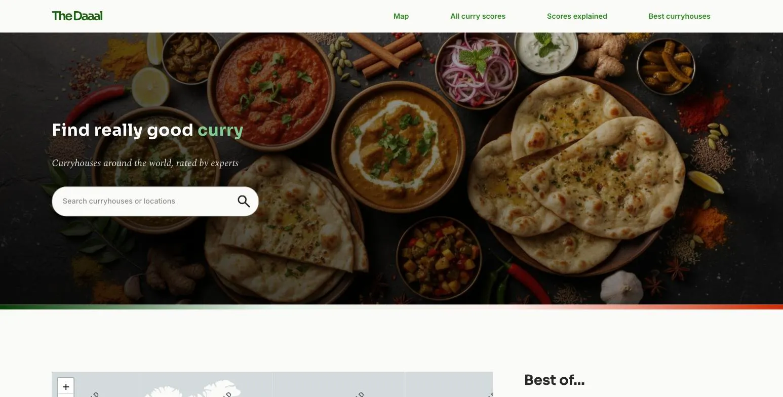
What is The Daaal?
The Daaal is a curry-house rating site. You can search by name or location, browse an interactive map, or dig into rankings across eight categories: curry, side dishes, naan, spiciness accuracy, price, atmosphere, service, and an overall score. It's live at thedaaal.com, and it's mine to use as much as anyone's: I built it because I wanted a version of this that didn't exist yet.
The brief I gave myself
There was no client and no deadline, which is rarer for me than it sounds. Most of the case studies elsewhere on this site involve stakeholders and quarterly targets. Here I set the brief myself: build something I'd actually use, rate curry houses properly instead of trusting a five-star average dragged down by one bad delivery, and use the project as a genuine test of how far Claude Code could go as a working partner, not just an autocomplete.
My role
Solo, end to end. Design, content, engineering, and the unglamorous ops work of keeping a live site fed with real data. Claude Code did a lot of the typing. I set the brief, wrote the rules it had to follow, and made the calls it couldn't.
Here's how that actually worked, in the order it happened. Jump to whichever bit interests you:
Researching faster
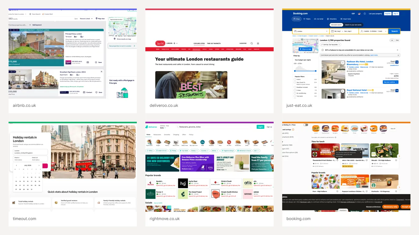
Before any of the design work started, I needed to know what good looked like elsewhere. I've built a small tool that screenshots a list of sites and drops them straight into a Figma moodboard, so I can look at how other booking, review, and listings sites handle search, filters, and cards without tabbing between twenty browser windows. Here's a page of that research, pulled together while I was trying to get a filter pattern right:
I also use a tool that runs a structured usability audit against Nielsen's 10 heuristics, and I've built more targeted versions of it too. This one went through thedaaal.com screen by screen, flagging specific interface gaps rather than a vague "this could feel nicer":
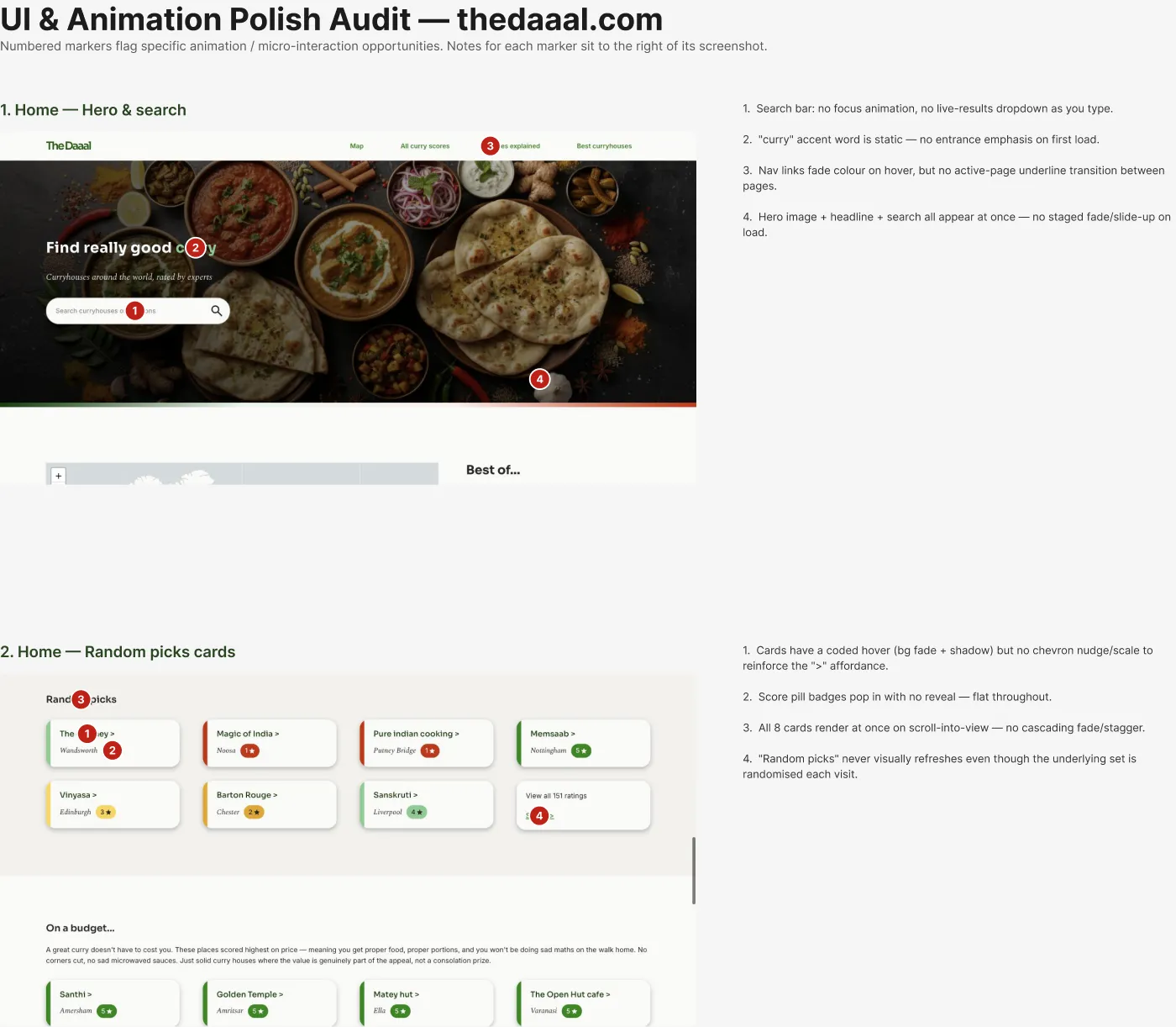
Some of what it flagged, a search bar with no focus state, cards that all appear at once with no stagger, is still sitting in a backlog. Not every finding gets fixed immediately, but having it written down and specific beats a general sense that something feels a bit flat.
Designing the system: Figma to code
The design lives in Figma first. Colours, type, and spacing are defined there, then mirrored into a token file the code actually reads from, so a colour never gets typed twice in two different places and slowly drifts apart. The palette has curry-adjacent names too: saffron for the gold accent, basmati for the neutral greys, cardamom for green, tandoor for red. A small thing, but naming a colour after what it's actually for makes it much easier to use correctly six months later.
Mobile isn't a squeezed-down version of desktop here. Once a mobile design exists for a page, it gets built as its own separate component, because the real mobile layouts tend to drop or reorder whole sections rather than just narrowing the desktop ones. That's slower than one responsive component trying to handle both, but it matches what was actually designed.
Teaching Claude Code the brand voice
Every restaurant on the site gets two pieces of copy: a longer description and a short one-liner for the map. I didn't want either to read like generic AI copy, so I wrote down the actual rules: never show a raw score, always convert it to a star tier first; never use words like "journey," "hidden gem," or "culinary experience"; keep the long blurb under 500 characters and the short one under 100. That's a voice and tone guide, the same kind of thing I'd write for a content team, just aimed at an AI instead of a person.
One long blurb, written to the brief
"A Delhi institution since 1959, Gulati's sits on Pandara Road near India Gate and has a serious reputation to live up to, and largely does. The butter chicken and garlic naan both score big here. Price takes a hit, it's on the pricier end, and waits can stretch to two hours on busy evenings, so book ahead. No booze either, so manage expectations. But for the food alone? Absolutely worth it."
That came from Claude Code, but only after it had read the rule that raw scores never appear as numbers, that certain phrases are banned outright, and that a caveat has to earn its place in 500 characters or less. The writing is generated. The judgement about what makes it good wasn't.
Automating the boring bits, with a human still on the button
Adding a restaurant to the spreadsheet should be the only manual step. Everything else, the map pin, the blurb, the dietary tags, gets filled in automatically by a script that diffs the sheet against what's already built. It also catches drift: if a restaurant's score changes on a repeat visit, the same check flags that the old blurb might no longer match the new scores, so the copy doesn't quietly go stale.
None of that reaches the live site on its own, though. Every production deploy still needs an explicit click, behind its own token, on a page that only exists at a non-public address. Automation earns its place for anything reversible and checkable. Anything that goes live in front of real users still needs a person to say yes.
When it went wrong (and the fix)
Before that setup existed, a routine push to a development branch briefly went live on the real production domain. Nobody was supposed to see it yet, but for a few minutes, anyone could have.
The fix wasn't a warning sign or a note to be more careful. It was structural: two entirely separate deployments now exist, one for the live site and one for everything still in progress, with no configuration path between them that could repeat the mistake.I'd rather build a system where the error can't happen again than trust myself to remember not to make it twice.
Outcomes
It's live. People use it. That's genuinely the outcome that matters here, more than any number I could quote that'll be different by the time you read this. Go have a look.
What this shows about working with AI
This isn't a site I'd have built pre-AI. Not because the ideas are complicated, but because a solo designer handling design, content, and deployment infrastructure end to end used to mean either learning to code properly or leaving most of it undone. I did neither. I learned to direct Claude Code the way I'd direct a small team: a written brief, explicit rules for the parts I care about most, and enough oversight that the parts I don't personally check still don't reach real users unsupervised.
That's the actual skill on show here. Not prompting, but the same judgement I'd bring to a design team, aimed at a different kind of collaborator. AI has changed what one person can reasonably attempt. Learning to use it well, rather than just using it, feels like the more useful thing to have picked up early.