
How I led a cross-functional redesign of Which?’s homepage – growing content capacity from 5 to 32 slots, driving a 78% lift in article visits, and giving the content team a research-backed toolkit to fight off HIPPO-driven decisions.
Background / context
Which?’s website contains a wealth of information and high quality content, produced by a large team of qualified testers and skilled writers. Its homepage is a key route through to that information.
The page presents a few problems, identified through research and collaboration with stakeholders:
Problem 1
The team that curates the content on the homepage is under bombardment from stakeholders who want their piece of content front and center on the homepage. They need to be able to choose the best content for our users, not just the content from the HIPPOs.
Problem 2
Users landing on the homepage have the following misconceptions;
1. Which? is just washing machine reviews.
2. Which? is commercial (it’s actually not-for-profit).
Problem 3
Users landing on the homepage often miss content because it’s hard to find.
My role
I took on a leadership role within the squad tackling this project, and my duties included owning the end-to-end design process, running workshops, directing research, and managing stakeholder relationships across multiple departments. Showing the business the value inherent in UX.
Here is a chronological(ish) list of how I tackled this project. Use the list to skip to parts you’re interested in, or scroll to see it all:
- Assumptions and hypotheses
- Involving the right people
- Ideation workshops
- Sketching
- Prototyping
- User testing
- Development
- Post-build monitoring and support
- Results
Assumptions and hypotheses
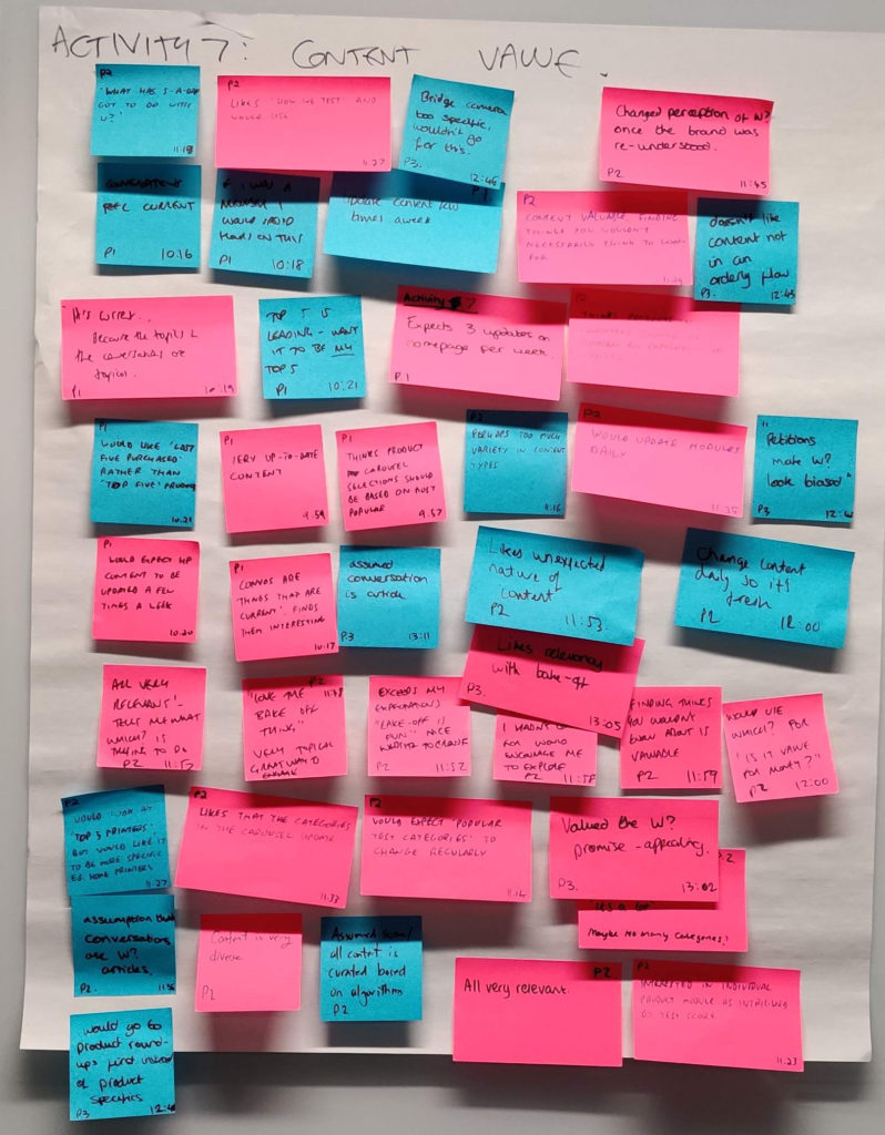
I began by compiling a list of insights gathered from previous user research, A/B testing, user interviews, competitor analysis… etc… etc… Any bit of insight I could get my hands on went into this document.
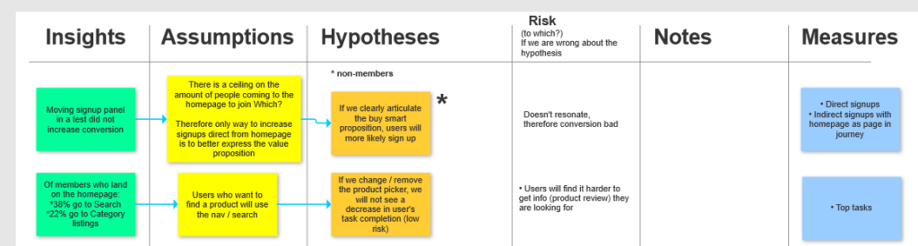
Once I had the insights in one place, I started to think about what assumptions we might be making. Assumptions are useful in this scenario because they help us form hypotheses. And hypotheses are testable!
These insights, assumptions and hypotheses form the basis for the project.
Involving the right people
I lead a cross functional team during this project. This included a UI designer, a product manager, developers, QAs, content designers, content representatives, SEO, A/B testing people. Naturally, all these people were included in the process from the off – participating in workshops, contributing to ideation etc.
But what about others in the business?
Which? is a magazine first and foremost, and magazines employ lots of writers and editors to create the content.
As the homepage garners so much traffic, there is obvious incentive for writers in the business to push for their content to appear on the homepage. That means the list of stakeholders is long, and their demands can be loud.
I needed a structure that would give people a voice without creating decision-by-committee paralysis, so I asked a senior leader from each department to send one representative. These reps were then the single point of contact for that department, and as a consequence of being involved early could relay the status of the project back through their respective channels.
Ideation workshops
My aim for ideation workshops: tackle defined problems with a group of qualified, skilled and influential people, in order to generate ideas and solve user and business problems.
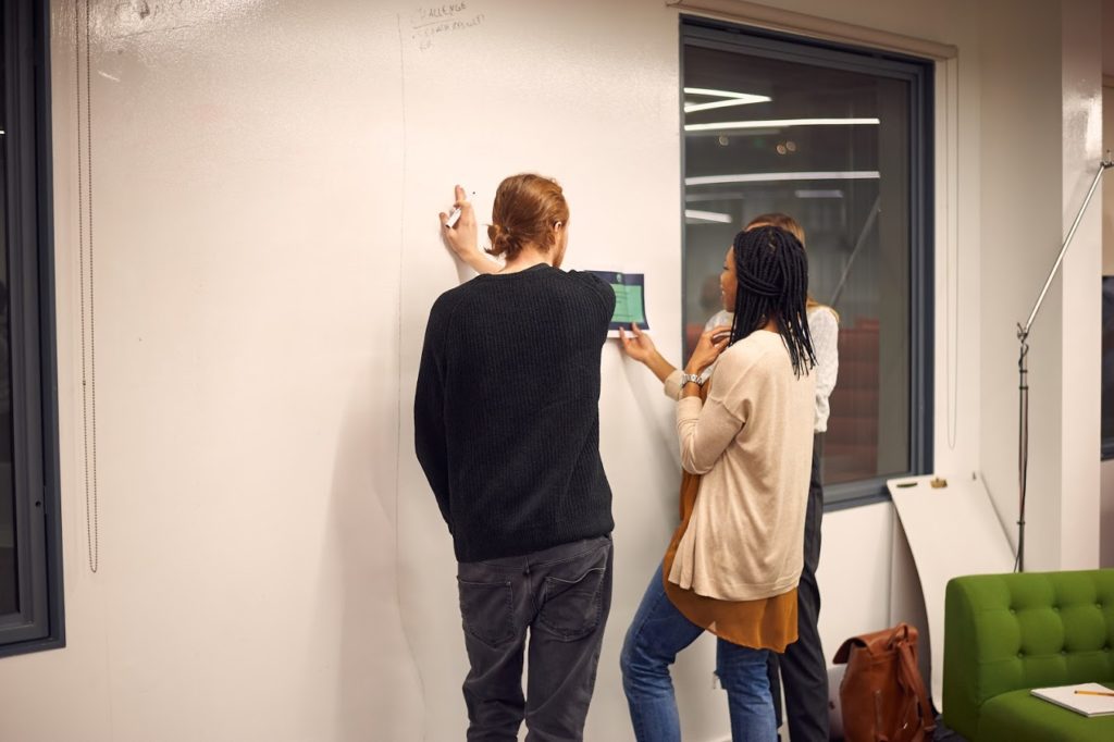
With this in mind, I gathered the team and the set of stakeholders I described above and we collaboratively generated a wealth of ideas that were broad and creative.
This broad pool of ideas contained some real gems and I had the group whittle the options down through dot voting and discussion until the best ideas were left.
Giving each stakeholder the chance to give feedback on potential solutions broadens the pool of ideas, makes them feel involved and lessens the friction they generate for the project as a whole.
Sketching
Sketching for this project actually started during the ideation workshop. Stakeholders got a chance to flex their creative muscles, and in return generated a set of rough early sketches which I could refine and mesh together.
Having the group do a short sketching exercise served two purposes. For one, it saved me time. And secondly it again helped them all feel a sense of connection to the output, which I believe reduced friction down the line.
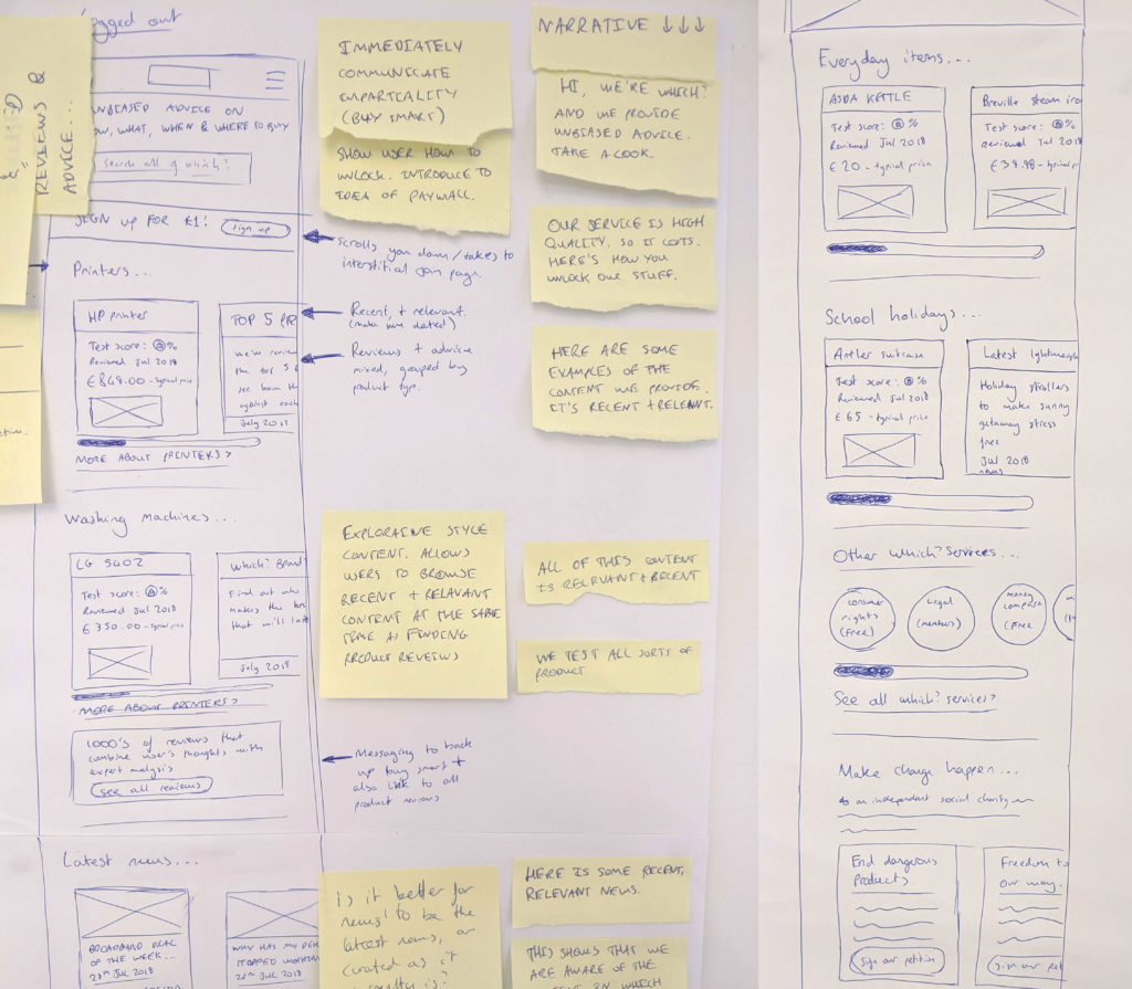
Once I’d tidied up and compiled the sketches, we could get our first impressions from real users through an informal user test.
We set a basic task for 5 people (navigate to x content) and as they ‘pressed’ the buttons, we acted as the computer. This type of testing feels informal and fun, and allowed us to get an early handle on structure, information hierarchy and information density.
Prototyping
We gained enough confidence from the first round of testing to move to digital.
I chose to stick fairly low fidelity for this prototype – when test participants see a rough prototype, they tend to judge it less based on the aesthetics, leaving more time for them to judge it on its usability. And we can test high fidelity designs later in the project when the core skeleton of the page is in place.
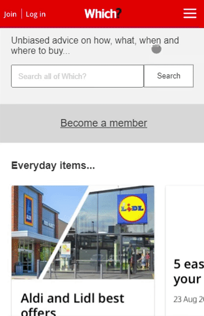
I created this protoype in Axure (although have since moved to Figma). It uses conditional logic to allow multiple pathways through the prototype (so it functions just like a webpage in the eyes of test participants). A key challenge was the carousel problem in Axure, which I solved using oversised containers and coded scroll logic in collaboration with another designer. Creating prototypes is a fun excercise in creative problem solving and one of my favourite parts of being a UX designer.
User testing
The overall aim for this testing was twofold. Firstly, iteratively improve the page according to our key metrics. Secondly, bring stakeholders along for the ride to reduce the friction they contribute to the outcome.
My role in the usertesting was from start to end. From negotiating for budget and lab time, through prepping the testing script and aligning the prototype with it, to facilitating a productive observation room‘s note taking.
This project went through three sets of usertesting in the lab. Each time it got more helpful and more polished. And stakeholders witnessed first hand the impact of our changes on user behaviour.
One key outcome from this testing was a document outlining the expectations and wants of users, in terms of content hierarchy.
Development
Development for the homepage was easy, because all of the developers had been involved in the process from an early stage. They all knew what needed to be built, and why. Some of their ideas had made it in to the design.
We began developing early, working in an agile way. Able to pivot when our understanding changed through testing, and iteratively improving. The efficiency gained from our ways of working allowed us to spend a significant amount of our focus on pagespeed and performance.
As development ran in parallel to the other activity, my role in it was a supporting one. Making sure that designs had enough detail that developers had no trouble, and keeping developers up to date with our thinking.
Post-build monitoring and support
Earlier I mentioned that a document came out of testing which highlighted expectations and wants of users in regard to content hierarchy. Once the page was live, this document was used as vital ammunition for the homepage curation team to show their stakeholders WHY they were making the decisions they were (read: why certain content was spotlighted over other content).
This document referenced usertesting videos (with links on where to find them on the company drive), pulled insights from the testing and even gave contact details for myself and the UX research team for further explanation. We made ourselves accountable for the outcomes of the research, and it gave the content curation team a crutch.
When data is available, it informs every decision I make. On this project, we had help from a team of Google Analytics experts. Together we monitored our key metrics and continued to highlight potential areas for improvement for months after launch. This insight again helped us form hypotheses…
When we formed a new hypothesis about part of the page that could improve, the most common route to testing that hypothesis was via an A/B test. And our A/B testing endeavours continued cyclically for months after the homepage was launched.
Results
So, did our solutions solve the problems we started with? Let’s look at each, one at a time:
Problem 1
The team that curates the content on the homepage is under bombardment from stakeholders who want their piece of content front and center on the homepage. They need to be able to choose the best content for our users, not just the content from the HIPPOs.
The content curation team were part of the group involved in usertesting, along with many of their stakeholders. This along with the supporting document I referenced above went a long way in quelling the many riotous voices and forming an atmosphere of cooperation. Add to this the new design which can accommodate many more pieces of content and what was once a problem (and a headache) has now dissolved.
“The new homepage and our lovely new guideline pack has revolutionised the way we work”
– Head of content creation team in an internal newsletter
Problem 2
Users landing on the homepage have the following misconceptions;
1. Which? is just washing machine reviews.
2. Which? is commercial (it’s actually not-for-profit).
It’s hard to prove categorically that you’ve altered perception, but here are some key indicators that help to paint the picture:
- More people now explore more than one product category when they’ve entered on the homepage (average went from 1.1 categories per visit to 1.4). And in on-site surveys we saw people’s perceptions lean toward viewing Which? as a reviewer for tech products as well as household goods.
- 14% more people now follow the link to the page with more detail on the not-for-profit status, what it means and how it works. Of those who go to that page from the homepage, exit rate is now 27% less.
Problem 3
Users landing on the homepage often miss content because it’s hard to find.
The homepage now has room for 32 pieces of content. Previously it housed 5. This means a raft of varied content is much easier to find. And it has worked, with visits direct from homepage to article content up by 78%. And content is surfaced in a better way hierarchically – we saw an average clickthrough rate per article of 23% compared to 18% previous.
Summary
Working in a cross-functional team with an agile methodology I enabled an outcome that satisfies the people who will use it, both end users and the content team running the page. Whilst doing so, I formed strong connections with groups across the business that UX rarely interact with and proved to them the value of the UX process. We exceeded many of our targets and paved the way for a squad model that was later rolled out across the entire digital team.