
I believe design decisions should be tested, not assumed. Here are two examples of how I use A/B testing to validate design thinking – one that confirmed a hypothesis, and one that revealed where the real opportunity lay.
My role in both of these tests was as the lead designer, collaborating with the CRO team, research team and other members of my cross functional squad. I’d push tests from inception and ideation through to completion and beyond: running ideation brainstorming workshops, building prototypes, building test scripts and analysing results.
Test 1 – Optimising sorting and filtering
Members: 35-38% uplift in filter usage. Non-members: strong results on desktop, inconclusive on mobile – so we shipped a desktop-only variant, projecting £18k in additional monthly revenue..
Background and context
Whilst working at Which?, I spent a lot of time optimising the listings page. This page houses links to every product that the Which? experts have reviewed, and the pages are separated into categories. I.e. there’s one listing page for washing machines, one for TVs, one for toothbrushes etc etc…
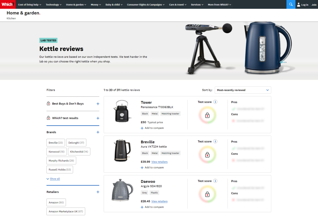
Each page is sort-able, and filter-able. And with 300+ entries in some categories, the sort and filter are key paths to finding a product review.
Members and non-members
Which?’s business model is based on subscriptions. When you subscribe, you get access to all the product reviews on the site and crucially for this test – unlock the best buy filter.

As a result, there’s actually two versions of these pages; a logged in version and a logged out version. And for each version we track success using different metrics.
Measuring success – what were our goals?
For members the main metric to improve is usage. We already had a pretty good idea that using sort and filter usually results in faster, more frequent engagement with products, and a lower exit rate once they do go to a product page. Filtered product page = better experience.
For non-members it’s all about conversion. More signups means more money for the business.
Forming hypotheses
When looking at data, the most common sort option selected was “Price (low to high)“. We also saw a large percentage of people filtering by “Best Buys” (a Best Buy is a badge given to high scoring products).
Hypothesis:
We think that the ultimate view people want to see is “Best Buys”, from lowest price to highest price.
We believe that implementing a shortcut to this view will result in people using that new shortcut
Designing the variations
Hypothesis formed, now it’s time to think about how best to implement the test. Judging by the traffic to our page we had time to run the control, plus two variations.
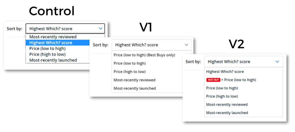
Members designs:
- Control – sort as usual
- V1 – a new sort option: “Price (low to high) (Best Buys only)”
- V2 – the same as V1 but with a visual treatment to highlight the Best Buy badge
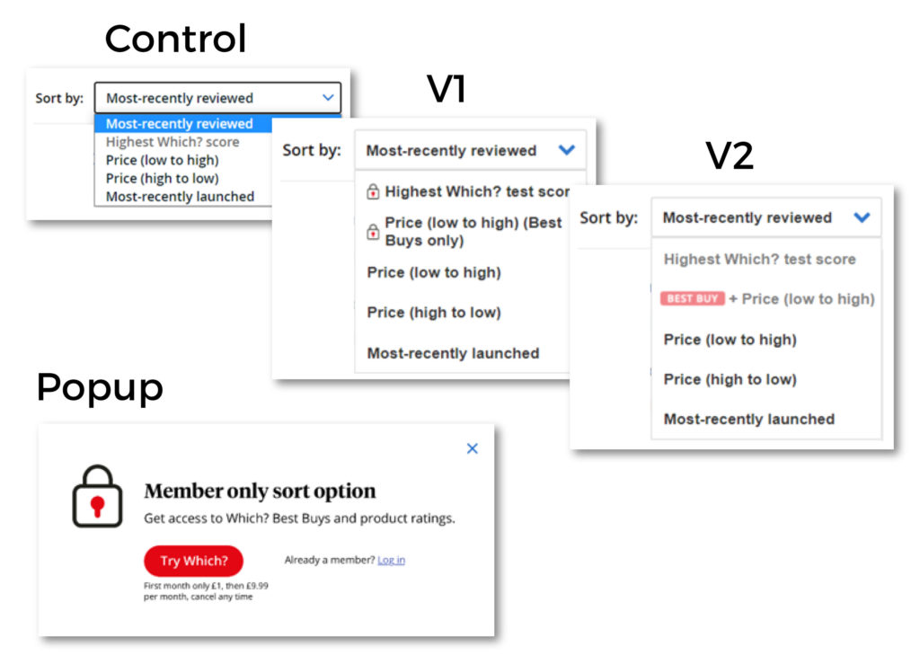
Non-member designs:
- Control – Sort as standard. You’ll notice “Highest Which? score” is greyed out as it’s locked for non-members
- V1 – a new sort option: “Price (low to high) (Best Buys only)”. However since non-members can’t access this filter, it includes a lock symbol. We also added a popup that shows when a locked filter is clicked.
- V2 – the same as V1 but with a visual treatment to highlight the Best Buy badge, and instead of locks we have greyed unavailable filters out. The popup still appears when clicked.
Test details
The test ran for 29 days – enough to reach statistical significance for key metrics. We ran the test across both mobile and desktop.
Results
Member results:
As mentioned above, for members we were keen to see if people wanted to use the new combined filter. And happily we saw an increase for both variations. For V1, a 35% increase (100% significance). And for V2 an even larger jump of 38%.
| Segment | Sessions | Best Buy filters | Rate | Difference | Confidence |
| Control | 166,747 | 7,658 | 4.59% | n/a | n/a |
| V1 | 164,925 | 10,249 | 6.21% | 35% | 100% |
| V2 | 165,912 | 10,512 | 6.34% | 38% | 100% |
What we can take from this is that both V1 and V2 were effective in showing more people a filtered view. And because we know that when people see a filtered view they see results more relevant to them, we can infer that the new filter option is a success for members.
Non-member results:
Our aim for non-members was to increase the amount of people who signed up after seeing this page. Lets take a look at the results for desktop users:
| Segment | Sessions | Best Buy sorts | Rate | Difference | Confidence |
| Control | 114617 | 1493 | 1.30% | n/a | n/a |
| V1 | 113959 | 1597 | 1.40% | 7.69% | 98.00% |
| V2 | 113264 | 1644 | 1.36% | 4.62% | 89.70% |
There’s some good news, and some not-so-good news. The good news is that V1 increased sign-ups by 7.69%, for desktop! Unfortunately, when we look at both mobile and desktop together, the story is only slightly positive.
| Segment | Sessions | Best Buy sorts | Rate | Difference | Confidence |
| Control | 252675 | 2458 | 0.97% | n/a | n/a |
| V1 | 252459 | 2510 | 0.99% | 2.61% | 82.10% |
| V2 | 252560 | 2513 | 1.00% | 2.73% | 82.40% |
There is still an uplift for both variations, but the test didn’t reach significance on either. This doesn’t mean the variations aren’t successful, just that we can’t be sure. Even if we had reached significance, the trend suggests that our uplift for all devices would be lower than the uplift for desktop only.
Mobile results didn’t reach significance – which meant shipping a blanket rollout would have been a guess. For this reason, we decided to go live with just the desktop variation for non-members. We projected an estimated 362 signups per month – that translates to £18k additional projected revenue each month.
We continued to monitor the performance of the page after launching. Key numbers like sign ups and usage followed the projected paths to an acceptable margin and so we can say that the test was a success. Having said that, there’s always room for improvement and so more testing on sort and filter was to follow.
Test 2 – Reducing complexity
Sometimes the simplest changes are the most effective ones. Removing visual clutter from a product page drove a 5.8% increase in engagement with key content.
Background and context
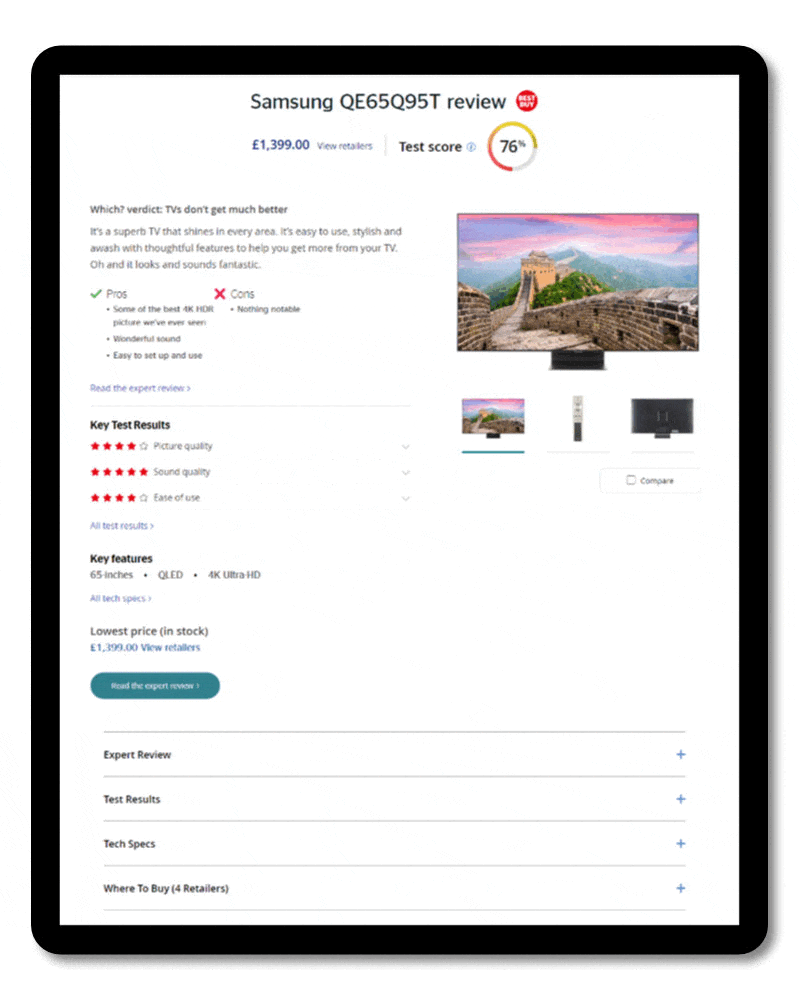
Once a Which? member narrows down their search to a few specific products, they’ll usually end up on those products’ “Product Pages“. It’s here that the expert review, test results, tech specs and other useful info is housed. Really, it’s what Which? members are paying for and so it’s key that these pages are easy to navigate.
And over the years, over many iterations of design (sometimes by committee!) the page has suffered a significant amount of information bloat.

The image above demonstrates the amount of information on the page. According to our findings in testing, it’s mostly useful information but not easy to scan. It’s disorganised, not grouped logically and there’s too much of it all at once. We think we can do better!
Measuring success – what were our goals?
Since this test was aimed at members, there was no ‘sign up’ metric to look at to determine success. Our aim for the test was to make the page easier to scan and find relevant information and there’s not a perfect metric to track that. The best option was to measure interaction with key information on the page. And, handily, our content is all contained inside accordions!
Key metrics
- Total accordion clicks per session
- Sessions with at least one accordion click
Hypothesis
We believe that if we remove visual clutter and group information in a logical way, people will be able to scan and find relevant information more regularly.
We’ll know if this is true by removing superfluous information and monitoring interaction with key information.
So, what did we test?
These pages have enough traffic to make a single variation test plausible, but not enough to run lots of different variations. So we’ve just got the one.
As you can see, we removed skip links, removed the duplicated price information and plucked the key features from half way down the page and surfaced them at the top, grouped with other overview info.
The overall effect of these changes was twofold:
- Reduced the scrolling required to reach the key information contained in the accordions
- Reduced complexity at the top of the page, which we anticipated would improve ‘scan-ability’.
Results
Total accordion clicks per session was our main metric to gauge if the changes were a success, since more accordion clicks translates to a likely increase in interaction with key content. All significance was 98%+.
| Sessions | Accordion clicks per session | Difference | |
| Control | 59,682 | 2.5 | N/A |
| Simple variation | 59,983 | 2.6 | 5.8% |
As you can see in the table above, accordion clicks per session was 5.8% higher in the variation – this means that with the new design users are 5.8% more likely to access key information. Success!
Our other goal was to increase the amount of people who click on at least one accordion;
| Sessions | Sessions with at least one accordion click | Difference | |
| Control | 59,682 | 58,126 | N/A |
| Simple variation | 59,983 | 59,744 | 2.27% |
These pages already performed well in this regard, but since we could increase this number we felt it a strong indicator that reducing the complexity at the top of the page put less people off, which we deemed a success.
Whilst we were able to prove that the changes we made resulted in an increase in interaction with key information further down the page, the test itself could not prove that ‘scan-ability’ was better with the new design.
To investigate this, we did a simple 5 second test on usertesting.com. We asked questions like “What information do you remember from this page?”, and “What specifications do you remember about this product?”. The results of this test were in favour of the variation, with more people recalling key information correctly when viewing the new design.
After all this evidence, we made the decisions to go live with the new design, and after monitoring its progress for the preceding months (real life metrics stayed in line with what we saw in the test) we can conclude that the design is a success.